Tech
What Is a Core App Dashboard? A Simple Guide for Beginners (2026)
Have you ever opened an app and felt confused? You see many numbers, charts, and alerts. But you don’t know what really matters. This happens a lot today because apps collect too much data every second.
Now think about something better. Imagine opening an app and seeing only the most important things. You quickly understand what is happening. You know what needs your attention. This is where a core app dashboard becomes very helpful.
In 2026, data is everywhere. Businesses, apps, and even smart homes collect data all the time. Without a clear system, this data becomes messy and hard to use. That is why people now rely on dashboards to keep things simple and clear.
A core app dashboard works like a control center. It shows everything important in one place. You don’t need to open many tools or reports. You get a full view in just one screen.
In this guide, we will explain everything step by step. You will learn what a core app dashboard is, how it works, why it is useful, and what makes it powerful. By the end, you will fully understand how it makes work easier and smarter.
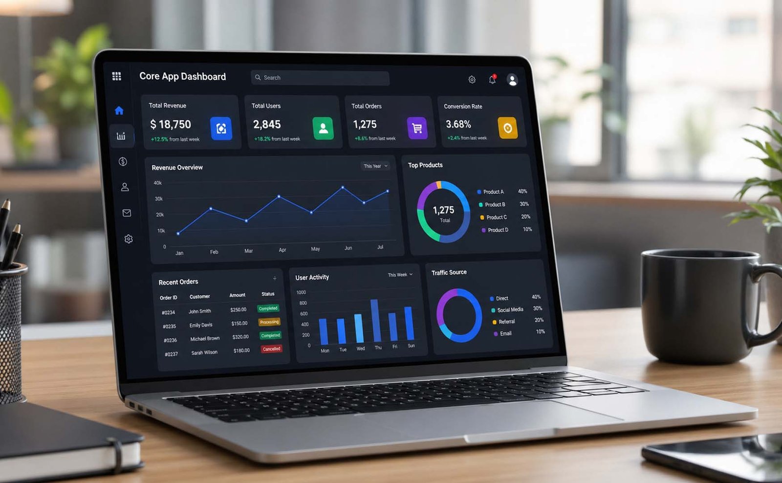
What Is a Core App Dashboard?
A core app dashboard is the main screen of an app. It shows the most important data in one place. You can think of it like the home screen that gives you a quick view of everything.
Instead of checking different sections or apps, the dashboard brings all data together. This makes things simple and easy to understand. It helps you focus only on what matters the most.
Another simple way to understand it is this. A core app dashboard is a single source of truth. This means all your data comes into one place. There is no confusion, no duplicate data, and no missing information.
For example, in a business app, the dashboard may show sales, users, and alerts. In a smart home app, it may show lights, energy use, and device status. No matter the app, the goal is the same — keep everything clear.
The main purpose of a core app dashboard is to save time and reduce stress. You don’t need to search for data. You don’t need to read long reports. Everything important is already in front of you.
How a Core App Dashboard Works
Let’s understand this in a very simple way. When a user logs into an app, the dashboard opens first. This is the main screen where all key data is shown.
The dashboard collects data from different sources. It can take data from apps, systems, or tools. Then it brings everything together and shows it in one clean place.
One very important feature is real-time updates. This means the data keeps changing automatically. You don’t need to refresh again and again. You always see the latest information.
For example, imagine you run an online store. Your dashboard shows your sales. If sales drop suddenly, you will see it right away. This helps you take action quickly before the problem gets bigger.
The dashboard uses charts, numbers, and alerts to explain data. This makes it easy to understand. Instead of reading long data tables, you just look at simple visuals and get the idea quickly.
Main Parts of a Core App Dashboard
A good core app dashboard has many simple parts. Each part helps the user understand data in an easy way. When all parts work together, the dashboard becomes very powerful.
The first part is KPI cards. These are small boxes that show important numbers. For example, total users, revenue, or tasks completed. They are usually placed at the top so users can see them quickly.
Next, we have charts and graphs. These help show trends and comparisons. A line chart shows growth over time. A bar chart compares different items. These visuals make data easy to understand.
Another important part is tables. Tables show detailed data. If users want exact numbers, they can check tables. This gives more depth when needed.
Then come filters and controls. These allow users to change what they see. For example, they can select a date range or choose a specific category. This makes the dashboard flexible and useful.
Finally, we have alerts and navigation. Alerts warn users about problems. Navigation helps users move around the app easily. Together, these parts create a complete and smooth experience.
Key Features in 2026
In 2026, a core app dashboard is smarter than before. It is not just about showing data. It also helps users understand and act faster.
One major feature is real-time data. This means the dashboard always shows fresh information. Users don’t have to wait. They can make decisions quickly based on current data.
Another important feature is customization. Every user is different. Some want sales data, while others want project data. The dashboard allows users to choose what they want to see.
Modern dashboards also work on all devices. Whether you use a phone, tablet, or computer, the dashboard looks clean and works smoothly. This makes it easy to use anytime and anywhere.
Many dashboards now include AI insights. This means the system can suggest ideas, show patterns, and even warn about problems. For example, it can tell you if sales may drop soon.
Another key feature is role-based access. This means different users see different data. A manager sees high-level data, while an employee sees task-level data. This keeps things organized and secure.
Why a Core App Dashboard Is Important
A core app dashboard is important because it makes life easier. Without it, people waste time searching for data in different places. This slows down work and creates confusion.
With a dashboard, everything is in one place. You don’t need to open many apps or reports. This saves time and makes work faster and smoother.
Another reason is better decision-making. When data is clear, decisions become easy. You don’t need to guess. You can see what is happening and take the right action quickly.
It also helps in reducing mistakes. When data is spread across many tools, errors can happen. But with one dashboard, data stays clean and accurate.
A core app dashboard also helps teams stay connected. Everyone sees the same data. This keeps everyone on the same page and improves teamwork.
Top Benefits You Should Know
One of the biggest benefits is having all data in one place. This reduces confusion and saves time. Users don’t need to switch between apps again and again.
Another strong benefit is easy access to information. Everything is visible in one screen. This makes it simple to understand what is going on without extra effort.
Dashboards also help in quick data analysis. Since data is updated in real time, users can act fast. This is very useful in business where quick decisions matter.
Customization is another big advantage. Users can change their dashboard based on their needs. This makes the experience more personal and useful.
Dashboards also help in tracking performance. You can see trends, progress, and results over time. This helps in finding areas that need improvement.
Finally, they reduce confusion and improve clarity. Clean visuals, simple layout, and real-time data make everything easy to understand and manage.
Perfect — I will continue smoothly from where we stopped, using the same easy tone, short lines, and full detail coverage
What Data Should You Track?
Now let’s talk about something very important. A core app dashboard is only useful if you track the right data. If you track the wrong things, the dashboard will not help much.
First, you should track business metrics. These include revenue, growth, and user numbers. You can also track customer cost, lifetime value, and how many users leave your service. These numbers help you understand your business clearly.
Next, you should track customer and account data. This includes customer accounts, vendor accounts, and employee accounts. You can see payment history, balances, and contact details. This helps you stay organized and avoid confusion.
You should also track payments and expenses. This includes total revenue, average order value, and payment methods. You can also track cash flow, billing, and unpaid invoices. This helps you manage money better.
Another important area is projects and tasks. You should track deadlines, team members, task progress, and project status. This helps teams stay on track and complete work on time.
Finally, track employee activity and performance. You can monitor time, productivity, and task completion. You can also track customer feedback and satisfaction. This gives a full view of how your system is working.
Types of Charts and Visuals
A core app dashboard becomes powerful when it uses the right visuals. Visuals make data easy to understand without reading long numbers or reports.
First, we have KPI tiles. These are small boxes that show one key number. For example, total sales or total users. They are simple and quick to read, which makes them very useful.
Next are line charts. These show changes over time. For example, sales growth over days or months. If you want to see trends, this is the best choice.
Then we have bar charts. These help compare different things. For example, which product sells more or which region performs better. This makes comparisons very clear.
Tables are also important. They show detailed data for users who want exact numbers. Heatmaps can show patterns, but they need a bit more focus to understand.
The main idea is simple. Always use the right visual for the right job. This makes your core app dashboard clear and easy to use.
How to Build a Core App Dashboard (Step by Step)
Building a core app dashboard may sound hard, but it is simple if you follow steps. Let’s break it down in an easy way.
Step one is to set your goal. Ask yourself what you want to track. Is it sales, users, or projects? A clear goal helps you build a better dashboard.
Step two is to choose your data sources. Decide where your data will come from. It can be apps, tools, or systems. Make sure your data is clean and correct.
Step three is to choose the right widgets and charts. Use KPI cards, charts, and tables. Pick only what you need. Do not add too many things.
Step four is to arrange everything in a clean layout. Place important data at the top. Group similar data together. Keep the design simple and easy to read.
Step five is to test and improve. Check if users understand the dashboard. Make changes if needed. Keep improving based on real use.
Simple Rules for a Clear Dashboard
A good core app dashboard must be clear. If it is confusing, people will stop using it. These simple rules help keep it clean and useful.
First, always design for user questions. Ask what the user wants to know. Then show that answer clearly on the dashboard.
Second, show only one idea per chart. Do not mix too much data in one place. This keeps things simple and easy to understand.
Third, keep the design simple. Avoid too many buttons, filters, or options. Simple dashboards are always better.
Use colors carefully. For example, red can show a problem, and green can show success. Too many colors can confuse users.
Always show trends over time. This helps users understand growth or decline. Start with a simple overview, then allow users to explore more details if they want.
Common Mistakes to Avoid
Even a good core app dashboard can fail if you make simple mistakes. Let’s look at the most common ones.
One big mistake is adding too much data. Many people think more data is better. But too much data makes the dashboard confusing and hard to use.
Another mistake is using too many colors. A colorful dashboard may look nice, but it can be hard to read. Always keep colors simple and meaningful.
Ignoring mobile users is also a problem. Many people use dashboards on phones. If your dashboard does not work well on small screens, users will leave.
Another mistake is not testing the dashboard. What looks clear to you may not be clear to others. Always test with real users.
Finally, avoid complex charts. If users cannot understand the chart quickly, it is not useful.
Best Tools to Build a Dashboard
You do not need to build everything from zero. Many tools can help you create a core app dashboard easily in 2026.
Some tools are very simple. Tools like Tableau, Power BI, and Looker allow drag-and-drop features. You can connect data and build dashboards without coding.
If you want more control, you can use tools like Chart.js or D3.js. These tools help you build custom charts. They are useful for advanced dashboards.
You can also use systems like Kohezion. It helps manage data and build dashboards in one place. It works like a database and dashboard tool together.
The best tool depends on your needs. If you are a beginner, use simple tools. If you want advanced features, use custom tools.
Real-Life Examples of Dashboards
A core app dashboard is used in many real-life cases. Let’s look at some simple examples.
A sales dashboard shows revenue, orders, and conversion rates. It helps businesses track growth and improve sales.
An invoice dashboard shows payments, overdue invoices, and cash flow. It helps manage money and avoid delays.
A project dashboard tracks tasks, deadlines, and team progress. It helps teams stay organized and complete work on time.
An employee dashboard shows productivity, attendance, and task status. It helps improve performance.
Even smart homes use dashboards. You can control lights, devices, and energy from one screen. This makes daily life easier and more organized.
Final Thoughts
Now you clearly understand what a core app dashboard is and why it matters. It is a simple but powerful tool that turns messy data into clear and useful information.
In 2026, data is growing every second. Without a dashboard, it becomes hard to manage. But with a core app dashboard, everything becomes simple and easy to understand.
It helps you save time, make better decisions, and stay organized. Whether you run a business, manage projects, or use apps daily, a dashboard can make your work much easier.
So if you are not using one yet, now is the best time to start. A core app dashboard is not just helpful anymore — it is something you truly need today.
(FAQs)
What is a core app dashboard in simple words?
A core app dashboard is the main screen of an app. It shows important data like numbers, charts, and alerts in one place. It helps users understand information quickly without checking many pages.
What data can I see on a core app dashboard?
You can see sales, users, payments, tasks, and system data. It depends on the app. The goal is to show the most useful information in a clear and simple way.
Is a core app dashboard only for businesses?
No, it is used in many areas. Businesses use it, but it is also used in smart homes, apps, and personal tools. Anyone who wants to track data can use it.
Do I need coding skills to build a dashboard?
No, many tools let you build dashboards without coding. Tools like Power BI and Tableau are very easy to use. But for advanced features, coding can help.
Can I customize my core app dashboard?
Yes, most dashboards allow customization. You can move widgets, choose data, and set filters. This helps you create a dashboard that fits your needs.
How often does a dashboard update data?
Most modern dashboards update in real time. This means data changes automatically. You always see the latest information without refreshing.
What makes a good dashboard design?
A good dashboard is simple, clean, and easy to understand. It shows only important data, uses clear visuals, and works well on all devices.
Don’t miss these:
What Are 5e Tools? A Simple Guide Every D&D Player Should Read

Why Higgsfield AI Image Generator Is Becoming the Default Tool for Gaming Brands Producing Launch Visuals Fast

Fast Secure VPN for Internet : Free Download iTop VPN

Vidmud AI Photo Editor Online Review: Smart Photo Enhancements Without Sign-Up

The Rise of Natural Lubricants in Modern Self-Care

Mabinogi Lazy Patch Explained: What It Is and Why Players Talk About It

The Most Important Statistics Concepts Every Data Scientist Should Know

Lenso AI Explained: How This Smart Face Search Tool Really Works

Entrepreneurial Skills: The Key Skills Every Future Business Leader Needs

Gramhir.pro Explained: What It Is and How It Creates AI Images

Perchance AI Review: Why So Many Creators Are Talking About It

Dale Russell Gudegast Biography: All You Should Know About Eric Braeden’s Wife

What Happened to Maureen Wilson? All About Robert Plant’s Ex-Wife

Jeremiah Peniata Fatu: Everything to Know About Jimmy Uso’s Brother

Meet Teresa Barrick: Fashion Designer, Mother, and Steven Tyler’s Former Wife

The Full Life of Lena Gieseke: Tim Burton’s Ex-Wife and Talented Artist

Peta Gibb’s Story: The Full Life of Andy Gibb’s Only Daughter

Anthony McClelland and LeBron James: A Father-Son Story Few Know About

Ria Sommerfeld: Everything to Know About Tom Kaulitz’s Former Wife

Who Is Emily Wickersham’s Ex-Husband? A Look at Blake Anderson Hanley’s Life

What Is Milohacherry Coin? A Simple Guide to This Fun Lifestyle Crypto
Why Higgsfield AI Image Generator Is Becoming the Default Tool for Gaming Brands Producing Launch Visuals Fast
Fast Secure VPN for Internet : Free Download iTop VPN
Vidmud AI Photo Editor Online Review: Smart Photo Enhancements Without Sign-Up
The Rise of Natural Lubricants in Modern Self-Care
Mabinogi Lazy Patch Explained: What It Is and Why Players Talk About It
The Most Important Statistics Concepts Every Data Scientist Should Know
Lenso AI Explained: How This Smart Face Search Tool Really Works
Entrepreneurial Skills: The Key Skills Every Future Business Leader Needs
Gramhir.pro Explained: What It Is and How It Creates AI Images
Perchance AI Review: Why So Many Creators Are Talking About It
-

 Biography3 months ago
The Emotional Journey of Joanne Schieble Simpson, Steve Jobs’ Biological Mother
-

 News2 months ago
Jamal Adeen Thomas – Everything You Should Know About Clarence Thomas’ Son
-

 Biography3 months ago
Meet Theo Ressler: Everything You Know About Jami Gertz’s son
-

 Celebrity4 months ago
Who Is William Douglas Sewell? Meet Rufus Sewell’s Musician Son